Switching from macOS to Windows
15 April, 2021
For the first time in almost a decade, I’m switching to Windows as my primary development machine at work.
As a frontend developer and UI designer I’ve always had the freedom to choose what platform I work on as the apps and technologies I’ve been involved with are pretty universal. HTML, CSS and JavaScript can be written anywhere and my design tool of choice — Figma — is cross platform and can even be used in the browser.
However, recently my day job has required me to become more full stack and start tinkering with the backend and middleware of our .NET application; which of course means, Windows.
Over the next however-so-long I’ll be blogging about my experience of switching over, highlighting the easy and not so easy parts, and hopefully providing a helpful resource for others who may be doing the same.
Hardware
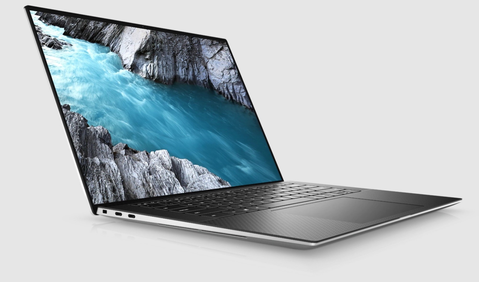
The MacBook I’ve just given up was a 2020 16" MacBook Pro, 2.6GHz 6‑core Intel Core i7, with 16GB RAM. I’m now on a Dell XPS 15 9500, 2.6GHz 6‑core Intel Core i7, with 32GB RAM. So in terms of specs, there’s not much in it.
My first impression of the Dell were how much nicer looking it is compared to the MacBook. Don’t @ me on this, but the design of the MacBook Pro is looking pretty stale right now and is well overdue the design refresh that is rumoured for 2021.
The Dell is all USB-C but only has 3 ports vs the MacBook’s 4, however it does have a SD Card slot which is nice (though I still would have preferred at least one USB-A port).
The trackpad on the Dell is on-par with the MacBook and has most of the same gestures. It also has a fingerprint sensor on the power key for using Windows Hello (the Windows equivalent of TouchID).
And of course, the keyboard on the Dell is about 1,000,000 times better than the MacBook. That MacBook keyboard will always be it’s downfall.
Annoyingly, the Dell XPS requires a 130W power supply meaning I have to use the included power supply rather than using the Pass-through power from my USB-C docking station like I was able to do with the MacBook (which required 96W).
Probably the biggest struggle I’m having with hardware so far is resetting all my muscle memory with the Apple keyboard layout. I decided to splash out on a Logitech MX Keys keyboard and MX Master 3 mouse to help alleviate this!
Software
For the most part, all the software I used on macOS has an equivalent on Windows except for a couple of stock Apple apps — Notes and Reminders. For everything else, there are suitable alternative stock apps on Windows.
Mail and Calendar are perfectly fine for checking my Gmail account.
Photos is able to sync my iCloud photo library via the iCloud app for Windows.
However there is no option to sync Apple Notes or Reminders with Windows alternatives so it looks like I may have to revert to third-party apps for both of these. I’ll probably stick with a combination of Todoist and Notion.
Windows + iPhone
When it comes to specifically using my iPhone with my computer, the only feature I really made good use of was the clipboard sharing with Apple’s Handoff mode. This was always pretty handy when copying something on one device and pasting it on another.
It doesn’t look like there’s an out-of-the-box solution for Windows + iPhone but I’m sure there’s a third-party which handles this. It’s just not a huge priority for me right now to explore further.
General User Experience
OK, so what about general day to day use of Windows vs macOS.
The first thing you notice is just how big and chunky everything is on Windows 10. A lot of this is down to the fact that Windows is available across a wide range of PC’s, including touch screens but it would be nice to have some finer control over this sizing when you’re using a laptop which doesn’t have a touch screen.
One of the things I miss the most so far is the macOS Menu Bar. It’s so convenient having a unified location for common settings and options. I find myself searching for far longer than I should be for individual app settings and with so many apps not following OS specific guidelines these days there really isn’t a standard way for settings to be displayed on Windows anymore.
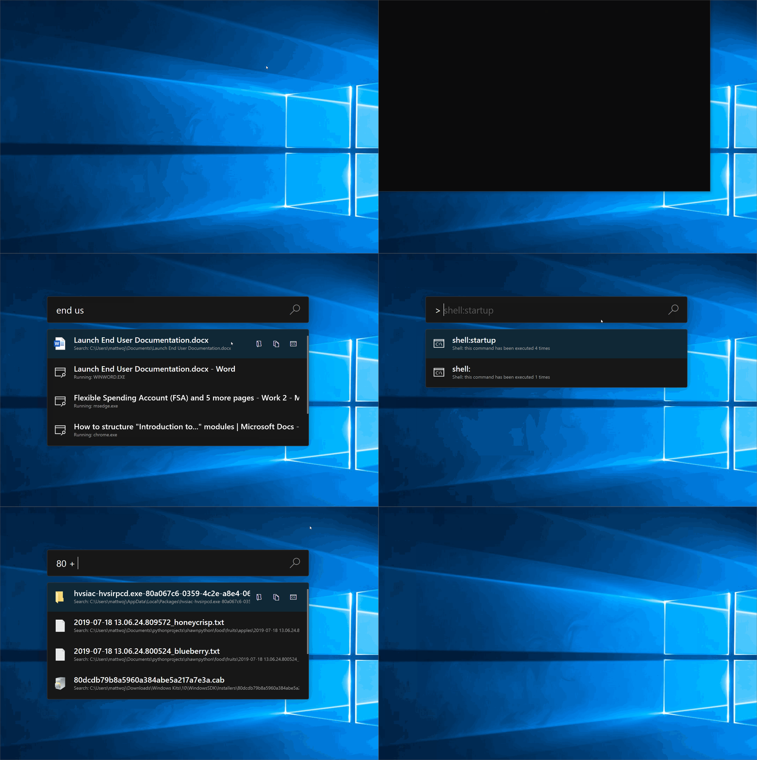
On macOS I used to always use Spotlight (cmd+space) to launch apps rather than using Launchpad or the applications folder. On Windows this is just as quick simply by pressing the Windows key and typing, but Spotlight offered definitely had a nicer UI.
Fortunately @JenMsft on twitter pointed me in the direction of PowerToys — A set of utilities to increase productivity — and one of these utilities is PowerToys Run. It basically looks and feels just like Spotlight and has mostly all the same features.
Quick look (previewing files by pressing space bar) is another thing you don’t get out of the box with Windows but I found a QuickLook app on Github which does the job pretty well.
And finally, lets just put this out there. Emoji on Windows are so ugly 😝.
Final thoughts
I’ve been on Windows now for little over two weeks and I must admit, I’m not missing my MacBook Pro or macOS as much as I was expecting to.
I think overall, with a few tweaks and third-party utilities you can make Windows 10 feel pretty close to what you’re used to with macOS and unless you’re reliant on any Mac-specific applications, most people can make the switch pretty easily.
This is my work laptop so of course it’s used primarily for web development which I’ve not talked about here. I’ll be writing down more thoughts on my switching experience over the coming weeks which will go into more detail about development environments, tools, shortcuts and workflows.

