Versions
A look back at the history of this site
Whenever I am learning a new programming language or CMS I tend to use my own portfolio website as a way of understanding it. Over the years this website has been built in a number of different ways and I’ve usually given the site a design update at the same time.
Here is an archive of previous designs with some notes on how that specific version was built.
v8.0
2021-Present
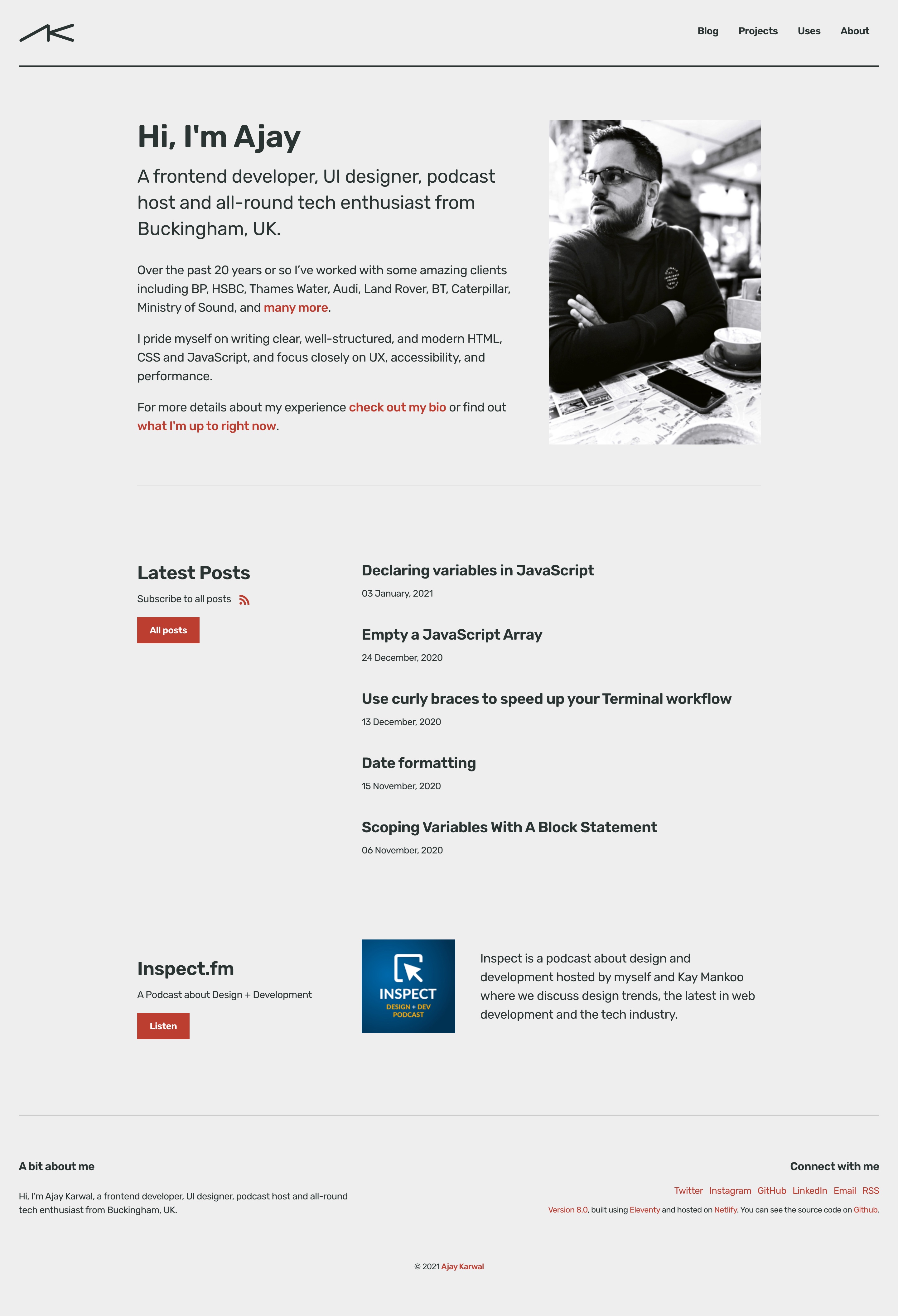
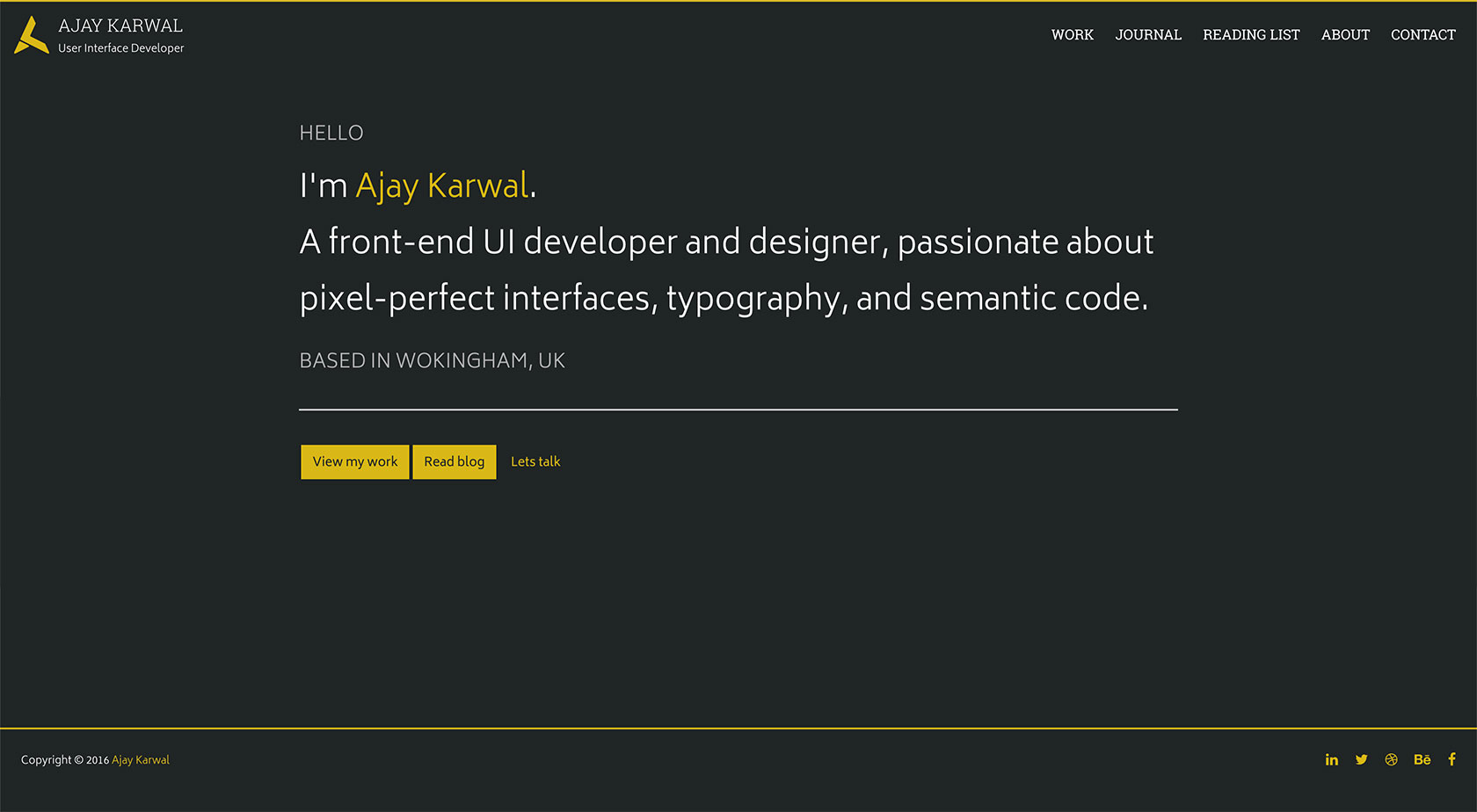
For version 8 I ported the site over to Eleventy.
I’d heard a lot of good things about Eleventy and upon some investigation it reminded me a lot of Jekyll (which v5.1 of this site was built in) so I knew it wouldn’t be too much work to get familiar with it.
The great thing about Eleventy over Jekyll is that it runs on JavaScript, so there’s no annoying Ruby dependencies to setup and manager. That, and the fact that it’s ⚡️ LIGHTNING FAST ⚡️ makes it a great choice for a site like this.
Version 8 also got a full redesign. I’ve updated my brand logo and colour scheme and focused a lot more attention on typography and overall vertical rhythm.
The site remains hosted on Netlify with the source code available on Github.
v7.0
2020-2021
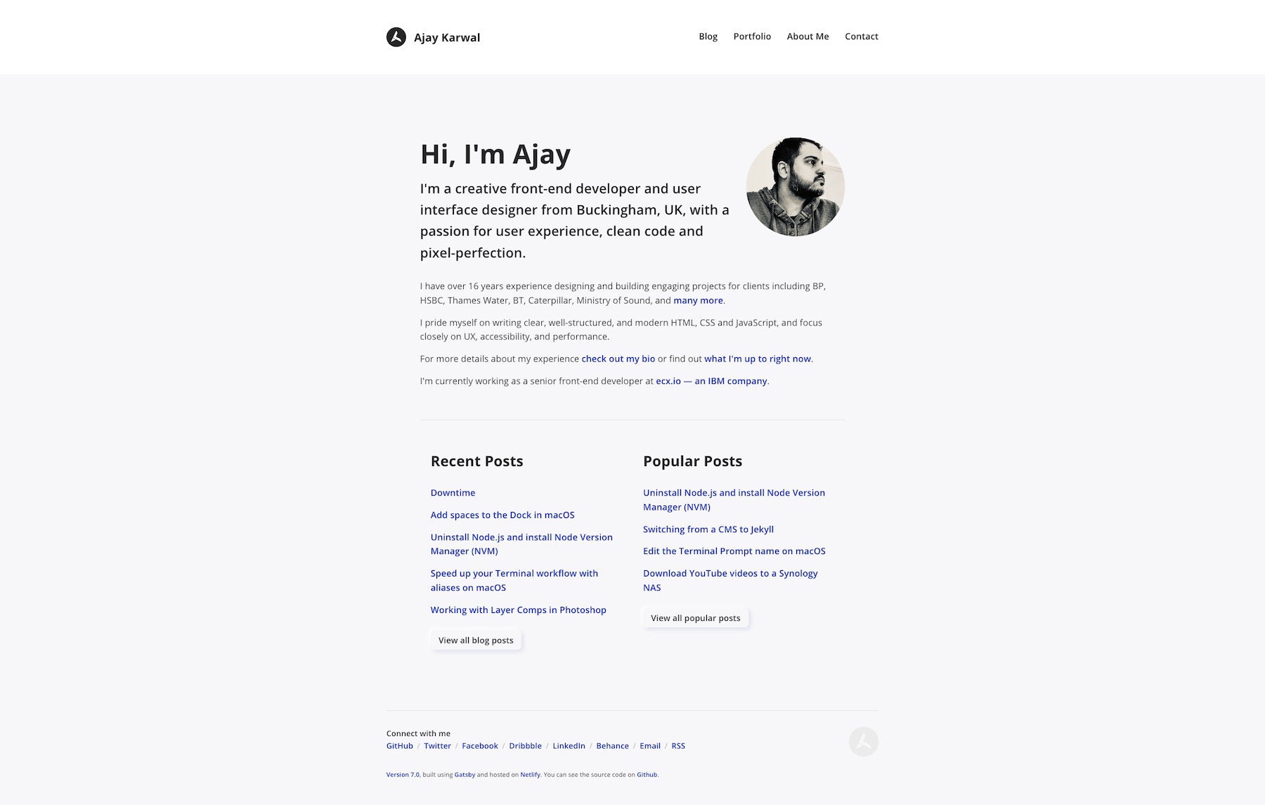
Version 7 of the site is now built with Gatsby and remains hosted on Netlify.
I’ve stripped back the design even further than before but focused more on typography, vertical rhythm and colour contrast. In particular, I’ve introduced elements of the 8-point Grid system which makes the relationship between various elements of the site feel more consistent.
I’ve also re-introduced a portfolio section which shows some of the clients I’ve worked with and some details about my role on some of the key projects.
v6.0
2018-2020
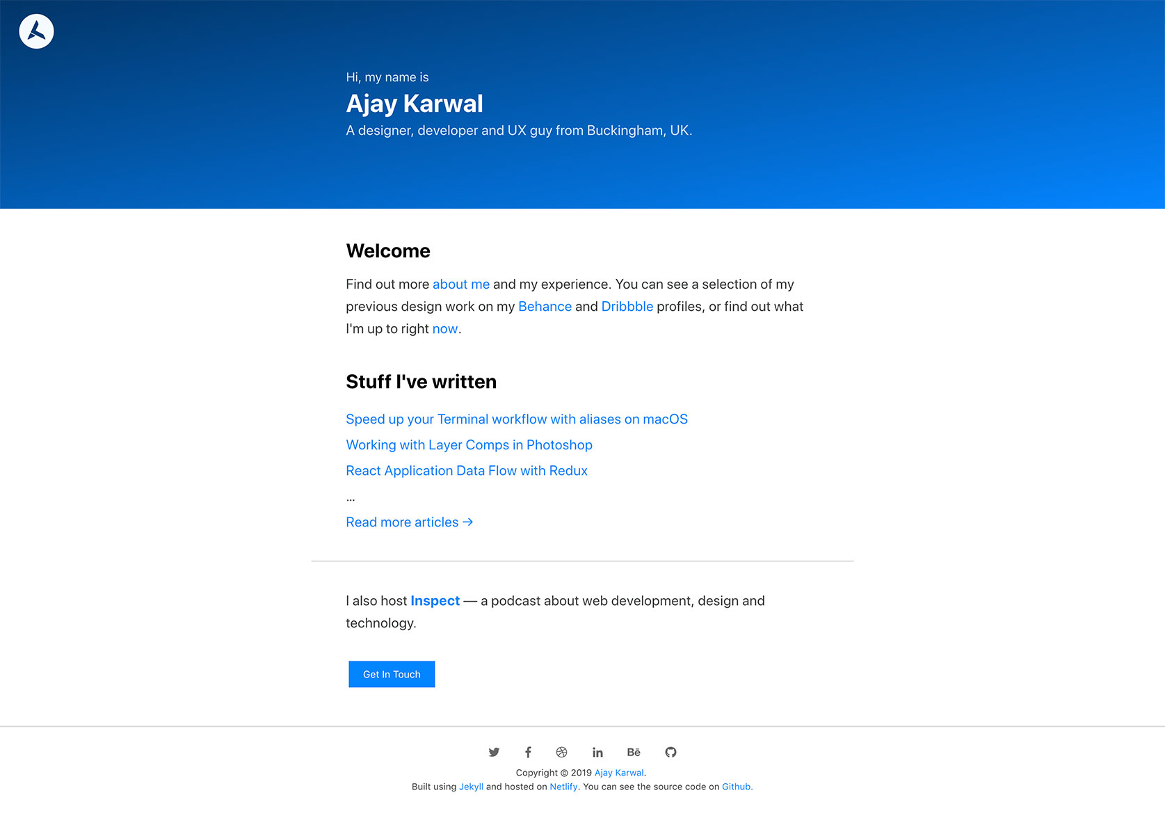
For version 6, the site has stayed on Jekyll but is now hosted on Netlify which deploys automatically when I push to the Master branch of my GitHub repo. The new design is much more stripped back with a bigger focus on written content and typography. I also stripped out jQuery, FontAwesome and switched to a system font stack which has masively increased the page load speeds.
v5.1
Version 5.1 had no significant changes to the design or the content. I just rebuilt the site in Jekyll as having a pretty simple website as mine didn’t warrant the overhead of running a CMS — especially one as heavy as Umbraco. I wrote an article about switching from a CMS to Jekyll.
The site was still hosted on Azure but I introduced a continuous integration workflow using Travis CI.
v5.0
2017-2018
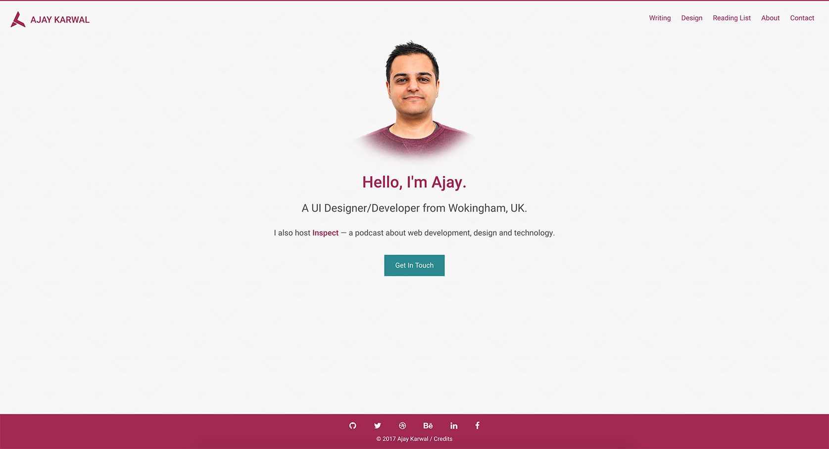
Version 5 stays on Umbraco and Azure but swsitched over to a light theme while keeping the basic layout as version 4.
v4.0
2016-2017
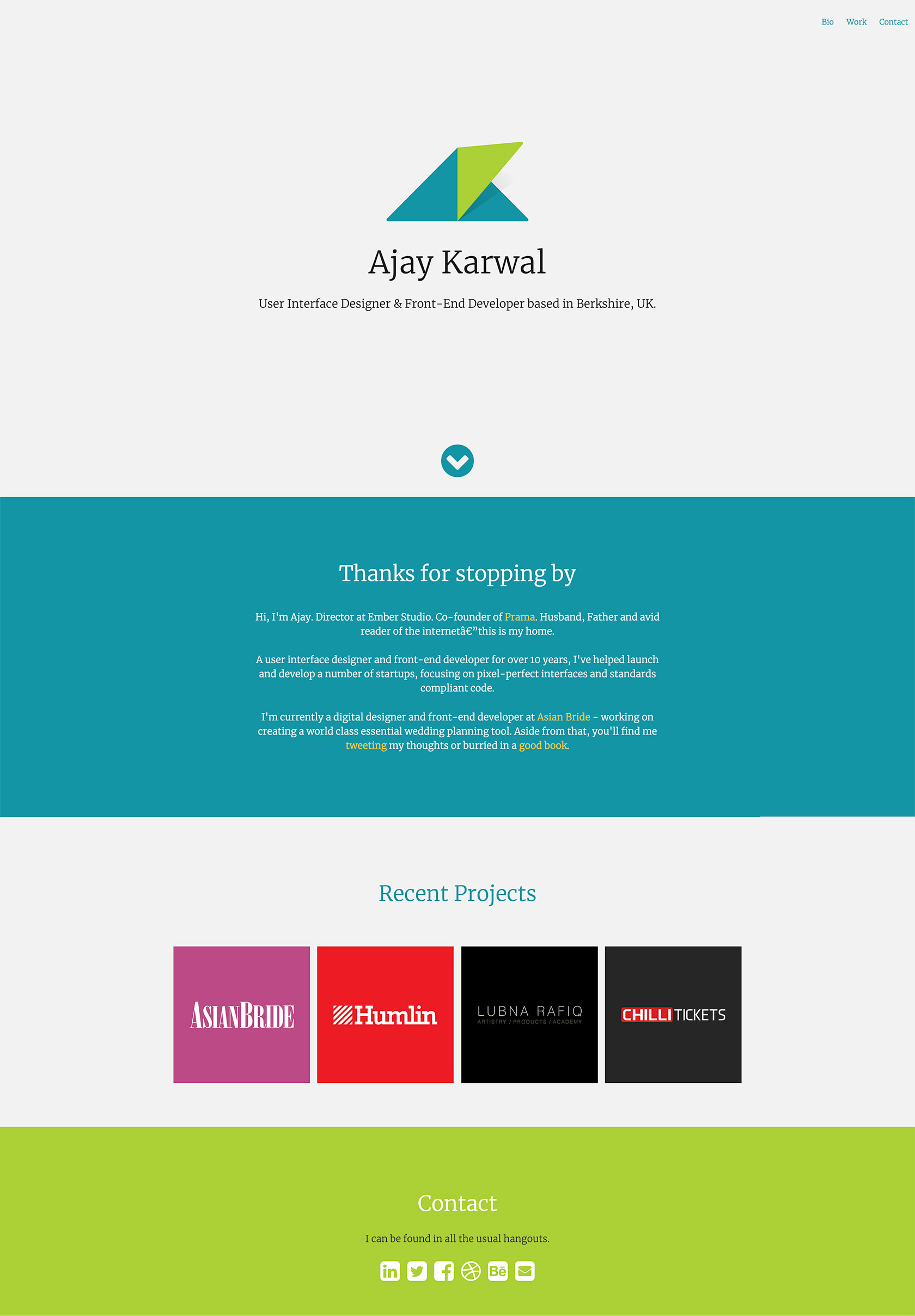
Version 4 is was the first CMS version of the website and introduced my new logo. I decided to build it in Umbraco as that was the platform the company I was working for at the time was using. I hosted the site on the free tier of Microsoft Azure.
v3.0
2014-2016
For version 3 I decided to give my personal identity a design refresh which introduced some bright colours and softer lines. This version of the site was built in PHP and included a lot more jQuery animations. I was aiming for a ‘single page web app’ look and feel which was the trend at the time.
v2.0
2012-2014
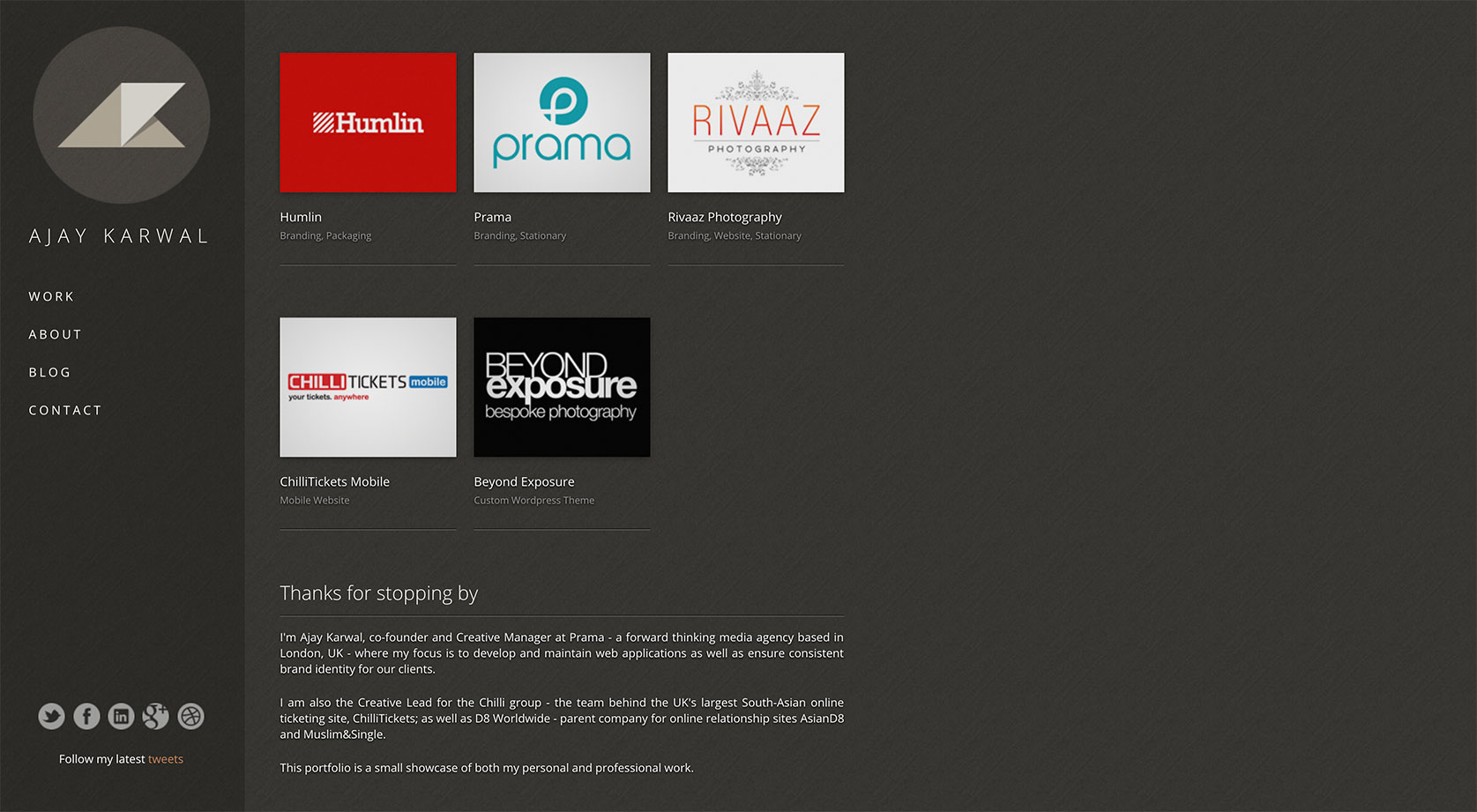
Version 2 was built using ASP.NET Web Forms. It was at a point in my career where I had enough experience and enough work to showcase in a proper portfolio and I wanted to create a personal identity for myself. The left column was fixed and took 100% height of the browser (which was still tricky to do back in 2012) while the right column scrolled.
The most significant thing about this version was that it used the (then) newly introduced HTML elements, <header>, <nav>, <main> and <footer>.
The left column is the <header> and the social icons at the bottom are the <footer> which was positioned absolute. This meant that the source code was well structured semantically while allowing the visual design to be a little less conventional.
v1.0
2010-2012
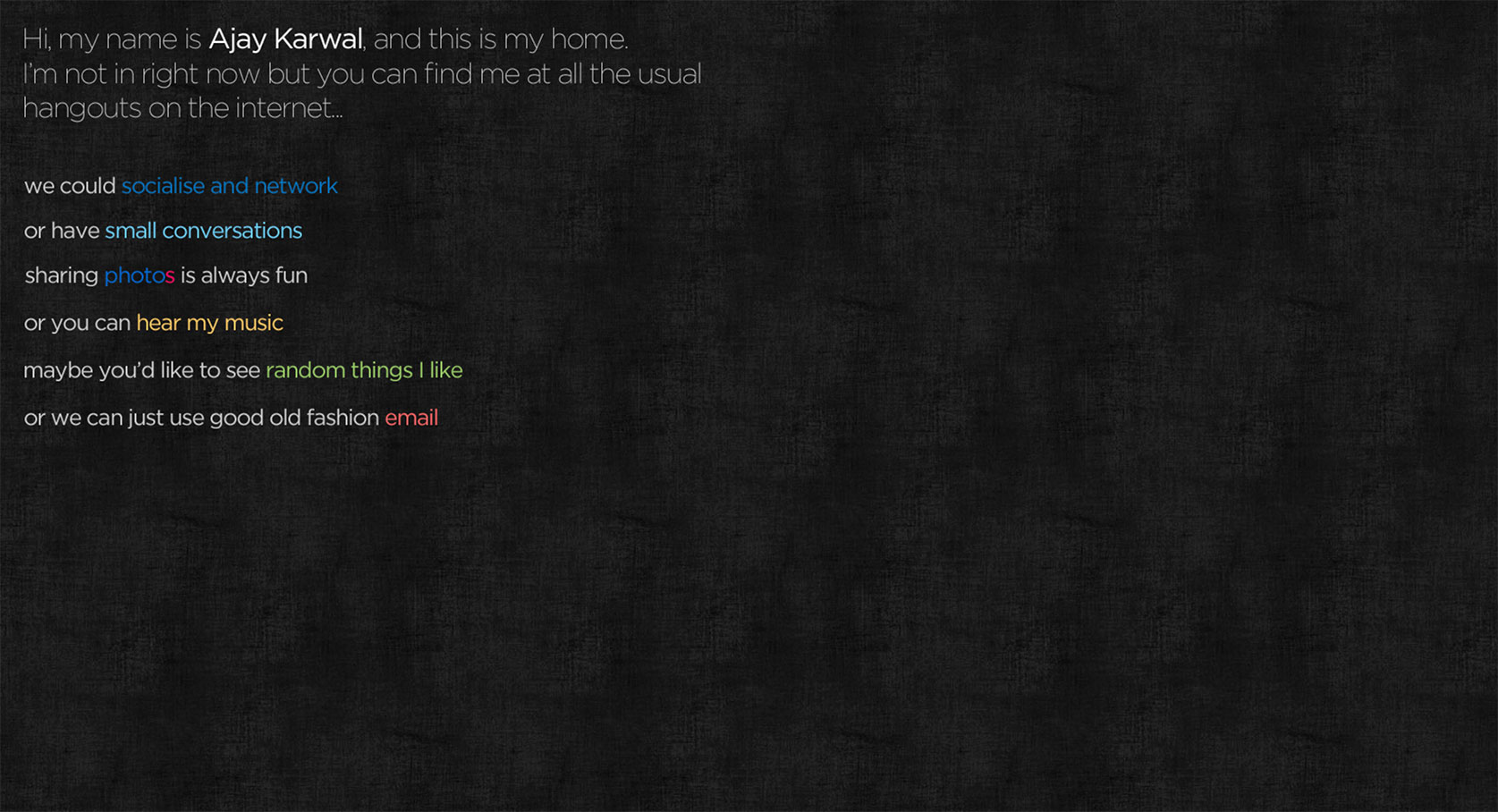
Version 1 of the site could hardly be called a website at all. It was just a single page with some links to my profiles on various networks. I even took the liberty to make each line of text into an image becuase of the custom fonts (this was pre-webfonts) and decided to be cryptic about where each link would even take you — can you figure them out?
I didn’t really have much to say about my experience at this point and my design portfolio was still quite thin.
